 The poster for the recent Irish horror film Shrooms features a clever subliminal image of a skull, formed by the silhouettes of three mushrooms set against a full moon in the background. While this is an effective and well done gimmick, it's also nothing new. There have been a number of similar optical illusions on scary movie posters in the past few years.
In today's saturated horror market, such methods make perfect sense. Any novelty that will make a film stand out from the crowd of theatrical and direct-to-video releases each year is a good thing. Eye-catching poster art has always been an effective way to generate interest in a title, especially when it makes you look a second and even third time.
 The upcoming thriller Pathology also employs a hidden skull in its poster design, although it's much more subtle. The artwork initially appears to be nothing but rows and rows of Polaroids.
We see snapshots of the main characters, some anonymous body parts, and what looks like the tiled walls of a morgue. Some of the photos are oddly framed or poorly lit, and the color has been washed out of all of them. When viewed at a distance, however, the light and dark areas of the snapshots form a photomosaic of a skull.
 The Region 1 DVD release of the New Zealand fright flick The Ferryman features yet another variation on the skull. This time the trick uses a sailboat at sea, with the vessel representing the nose and the moonlit waves suggesting the jaw and teeth. The clouds forming the eye sockets are a bit dubious, though, and make the illusion seem forced.
Nonetheless, First Look Pictures must have thought this design approach would turn more heads than the theatrical poster. The original campaign went with more of a grindhouse aesthetic, featuring cropped close-ups of the actors looking terrified. Perhaps they thought the U.S. home video market already had more than enough images of tortured women on DVD covers (see Pulse, Wolf Creek, Living Death, and The Hills Have Eyes, just to name a few).
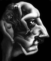
 These hidden skulls are actually just the latest in a long tradition of illustrated illusions. Novelty postcards depicting double images were very popular around the end of the nineteenth century. For example, the picture to the right might seem to be a cluster of women in various poses, but a second look would find a man's profile forming out of their huddled mass.
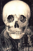
The artists behind these images employed a handful of visual tropes, but the human skull was by far the object most often evoked (which explains why the gimmick is a favorite of horror movie poster designers). Some notable early examples are Charles Allan Gilbert's "All Is Vanity" from 1892, Judge Magazine's May 1894 cover, and "L'Amour de Pierrot," an anonymous French postcard circa 1905.
 All Is Vanity All Is Vanity(1892) |  Judge Magazine Judge Magazine(1894) |  L'amour de Pierrot L'amour de Pierrot(1905) |
The Spanish surrealist Salvador Dali contributed several works to the canon of hidden skull imagery. He illustrated the dangers of casual sex and venereal disease in a wartime poster depicting a soldier looking at two comely females. Shift your eyes and he hints at the consequences of an affair with these women.
 Soldier Take Warning (1942) |  Skull of Zurbarán (1956) |
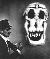
 One of the most celebrated of Dali's endeavors in this field is his "In Voluptas Mors" (a.k.a. "Human Skull Consisting of Seven Naked Women's Bodies") from 1951. The image is very much in the spirit of the French novelty postcards from five decades earlier.
His artful arrangement of the female form has turned up in the artwork for two different motion pictures. The marketing for Jonathan Demme's Silence of the Lambs subtly placed the image on the back of a "Death's Head" moth, while a sextet of spunky spelunkers strike similar poses on the poster for the British horror film The Descent.
 The Silence of the Lambs (1991) |  The Descent (2005) |
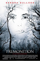
The one-sheet for the Sandra Bullock thriller Premonition gives a haunting impression of her likeness through some strategically placed branches, leaves and birds. This impressive effect is also reminiscent of Dali's art. The forming of a face with tree branches is a trick he employed in 1974 with his "Transformation of ‘Antiques’ Magazine Cover into the Apparition of a Face."
 Antiques Magazine (1974) |  Premonition (2007) |
A stand of trees form yet another subliminal skull in the poster for Eli Roth's 2002 breakout film Cabin Fever. The dwelling itself provides the teeth for the image. The various elements of the layout bring to mind the artwork used for the House on the Edge of the Park. The face of the skull is formed in much the same way, but the inclusion of the cloak and bony hand destroys any subtlety the illusion might have had. The Italian chiller represents the earliest use of this imagery in contemporary film marketing that I encountered in my research.* If anyone knows of additional examples in this field, please add a comment to this post.
 House on the Edge of the Park (1980) |  Cabin Fever (2002) |
*An exception would be the elegant line drawing illusion used on posters for The Killing of Sister George. Although not in the horror genre and therefore outside of the scope of this post, the film was released in 1968.
 UPDATE 11/26/08
Sony Pictures recently unveiled a cool animated poster for the upcoming sequel Terminator Salvation (2009). A bird's eye view of Los Angeles is ravaged until it resembles the skull-like head of a Terminator android. An animated flash version is viewable on the official Sony Pictures film site.
See also: Tarsem Channels Dali


2 comments:
These are all great; I'm a fan of the school of poster-making patterned after the Dali work. This would be a great gallery exhibit some day. Someone would have to be murdered, of course.
This is brilliant and well-researched. Thank you for all your hard work. :)
Post a Comment