February 28, 2008

Check Your Local Listings

An amusing side effect of the modern multiplex is the crowded marquee. Take a couple of proper name film titles and a verb-based film title, and then fit them in a confined space and titter at the accidental phrases that occasionally result. While this sort of thing has been fodder for 'funny photo' forums and obnoxious catch-all humor sites for years, last summer's release of the film Knocked Up made possible an unprecedented number of suggestive juxtapositions. Theater signs around the country seemed to be boasting more paternity claims than a TiVo filled with Maury Povich episodes.

In the interest of interest, I have put together what very well may be the most comprehensive collection of "naughty movie sign" photos anywhere. Here, then, is a rundown of various examples from the last seven years or so.

Knocked Up WaitressAlthough short and sweet, this one gets bonus points for working on more than one level. Not only do you have a fine "Whoops! I'm pregnant!" double feature, but the sign simultaneously describes the premise of the second movie.


Knocked Up Nancy DrewThe beloved teen detective has grown up fast for this modern day film version. If only we had an idea of who was responsible for this predicament.


Fantastic Four Knocked Up Nancy Drew
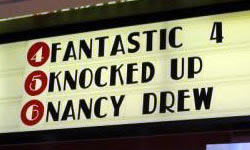
That's what you get for asking. It must've been one wild night. Either all four of them did the deed, or Johnny Storm is the culprit and the rest of the gang decided to share the blame as a show of team solidarity.


Mr. Brooks Knocked Up Nancy DrewWell, now it looks like the mysterious Mr. Brooks is also a candidate for fatherhood. The plot thickens.


Harry Potter Knocked Up Nancy DrewThe boy wizard appears to be yet another suspect. This particular photo also gave birth to its own YTMND site. Click here if the preceding abbreviation looks like a keyboard spasm to you.


Mr. Brooks Knocked Up Nancy DrewA second claim of Mr. Brooks as the daddy. He's a dirty old man! There's even a blog named after this particular phrase.


Harry Potter Knocked Up Evan AlmightyThat would have to have been an immaculate conception.


Pirates Knocked Up ShrekWhat do you expect? They are pirates, after all.


Stick It Inside ManIn case you were wondering where to start in getting someone knocked up.


40 Year Old Virgin Corpse BrideA ringing endorsement for necrophilia.


North Country PrimeThe blog where I found this photo hit the nail on the head in the original post: "Second-run movie theater marquee or worst personal ad ever?" Indeed.


Spy Kids Blow PokemonBefore Knocked Up came along, clever theater employees made the most out of the release of Blow.


Spy Kids Blow Crocodile Dundee in Los AngelesThose Spy Kids have fallen on hard times.


Blow the Mexican Crocodile Dundee in Los AngelesWow. That's a mouthful (shameless pun intended).


The Mexican Snatch Just VisitingIf they had put Just Visiting first it would've made a lovely souvenir postcard for a Tijuana brothel.


Erin Brockovich Screwed My Dog SkipThis was the first "naughty movie sign" I saw online, circa the year 2000. It's still one of the best.


The Iron Giant DickI may as well end on a dick joke.

As a sidenote to this topic, here's a pair of photos showing some strategic poster placement in two different movie theaters. The trio of posters in both examples form the same subliminal suggestion. Superman Returns and Eragon are the first two films advertised, while the third poster is X-Men III and Pirates of the Caribbean 2, respectively.

Subliminal S - E - X

Still want more? Check Your Local Listings, Part 2!

February 26, 2008

The Saul Bass Look

The world of graphic design lost Saul Bass in 1996. Whether or not you know the man's name, his pioneering style in poster art is easily recognized. He did memorable artwork for The Man With the Golden Arm, Vertigo, West Side Story, and Bunny Lake Is Missing.

Bass's influence can still be seen, and there's been several examples in the dozen years since his passing. A recent one is Before the Devil Knows Your Dead, designed by Cold Open, Inc. Besides being a shortcut to retro cool, following the design icon's lead has other advantages. The stark contrasts in color and simplicity of the images are very eye-catching, and the ample use of negative space allows plenty of room for review quotes in newspaper ads (a key reason why ThinkFilm went with the look).

Here's an overview of nine other film posters that have borrowed from his style to various degrees.

Clockers (1995)Clockers
(1995)
The Butcher Boy (1997)The Butcher Boy
(1997)
Lock, Stock and Two Smoking Barrels (1998)
Lock, Stock and
Two Smoking Barrels

(1998)

Idle Hands (1999)Idle Hands
(1999)
Small Time Crooks (2000)Small Time Crooks
(2000)
Criminal (2004)Criminal
(2004)

The Prisoner (2006)The Prisoner
(2006)
The Protagonist (2007)The Protagonist
(2007)
Flawless (2007)Flawless
(2007)


Burn After Reading (2008)UPDATE 11/20/08
While the initial poster artwork for the Coen Bros. comedy Burn After Reading (2008) certainly showed a Saul Bass influence (particularly in the typeface), this later design echoes his style even more.


For a thorough appreciation of Saul Bass's portfolio:

Saul Bass on the Web


Titles Designed by Saul Bass

Design Musem: Saul Bass

February 22, 2008

Hidden Images in Horror Movie Art

Shrooms (2008)The poster for the recent Irish horror film Shrooms features a clever subliminal image of a skull, formed by the silhouettes of three mushrooms set against a full moon in the background. While this is an effective and well done gimmick, it's also nothing new. There have been a number of similar optical illusions on scary movie posters in the past few years.

In today's saturated horror market, such methods make perfect sense. Any novelty that will make a film stand out from the crowd of theatrical and direct-to-video releases each year is a good thing. Eye-catching poster art has always been an effective way to generate interest in a title, especially when it makes you look a second and even third time.

Pathology (2008)The upcoming thriller Pathology also employs a hidden skull in its poster design, although it's much more subtle. The artwork initially appears to be nothing but rows and rows of Polaroids.

We see snapshots of the main characters, some anonymous body parts, and what looks like the tiled walls of a morgue. Some of the photos are oddly framed or poorly lit, and the color has been washed out of all of them. When viewed at a distance, however, the light and dark areas of the snapshots form a photomosaic of a skull.

The Ferryman (2007)The Region 1 DVD release of the New Zealand fright flick The Ferryman features yet another variation on the skull. This time the trick uses a sailboat at sea, with the vessel representing the nose and the moonlit waves suggesting the jaw and teeth. The clouds forming the eye sockets are a bit dubious, though, and make the illusion seem forced.

Nonetheless, First Look Pictures must have thought this design approach would turn more heads than the theatrical poster. The original campaign went with more of a grindhouse aesthetic, featuring cropped close-ups of the actors looking terrified. Perhaps they thought the U.S. home video market already had more than enough images of tortured women on DVD covers (see Pulse, Wolf Creek, Living Death, and The Hills Have Eyes, just to name a few).

Anonymous French postcardThese hidden skulls are actually just the latest in a long tradition of illustrated illusions. Novelty postcards depicting double images were very popular around the end of the nineteenth century. For example, the picture to the right might seem to be a cluster of women in various poses, but a second look would find a man's profile forming out of their huddled mass.

The artists behind these images employed a handful of visual tropes, but the human skull was by far the object most often evoked (which explains why the gimmick is a favorite of horror movie poster designers). Some notable early examples are Charles Allan Gilbert's "All Is Vanity" from 1892, Judge Magazine's May 1894 cover, and "L'Amour de Pierrot," an anonymous French postcard circa 1905.

All Is Vanity (1892)All Is Vanity
(1892)
Judge Magazine (1894)Judge Magazine
(1894)
Anonymous French postcard (1905)L'amour de Pierrot
(1905)

The Spanish surrealist Salvador Dali contributed several works to the canon of hidden skull imagery. He illustrated the dangers of casual sex and venereal disease in a wartime poster depicting a soldier looking at two comely females. Shift your eyes and he hints at the consequences of an affair with these women.

Soldier Take Warning (1942)
Soldier Take Warning
(1942)
Skull of Zurbarán (1956)
Skull of Zurbarán
(1956)

In Voluptas Mors (1951)One of the most celebrated of Dali's endeavors in this field is his "In Voluptas Mors" (a.k.a. "Human Skull Consisting of Seven Naked Women's Bodies") from 1951. The image is very much in the spirit of the French novelty postcards from five decades earlier.

His artful arrangement of the female form has turned up in the artwork for two different motion pictures. The marketing for Jonathan Demme's Silence of the Lambs subtly placed the image on the back of a "Death's Head" moth, while a sextet of spunky spelunkers strike similar poses on the poster for the British horror film The Descent.

The Silence of the Lambs (1991)
The Silence of the Lambs
(1991)
The Descent (2005)
The Descent
(2005)

The one-sheet for the Sandra Bullock thriller Premonition gives a haunting impression of her likeness through some strategically placed branches, leaves and birds. This impressive effect is also reminiscent of Dali's art. The forming of a face with tree branches is a trick he employed in 1974 with his "Transformation of ‘Antiques’ Magazine Cover into the Apparition of a Face."

Antiques Magazine (1974)
Antiques Magazine
(1974)
Premonition (2007)
Premonition
(2007)

A stand of trees form yet another subliminal skull in the poster for Eli Roth's 2002 breakout film Cabin Fever. The dwelling itself provides the teeth for the image. The various elements of the layout bring to mind the artwork used for the House on the Edge of the Park. The face of the skull is formed in much the same way, but the inclusion of the cloak and bony hand destroys any subtlety the illusion might have had. The Italian chiller represents the earliest use of this imagery in contemporary film marketing that I encountered in my research.* If anyone knows of additional examples in this field, please add a comment to this post.

House on the Edge of the Park (1980)
House on the
Edge of the Park

(1980)
Cabin Fever (2002)
Cabin Fever
(2002)


*An exception would be the elegant line drawing illusion used on posters for The Killing of Sister George. Although not in the horror genre and therefore outside of the scope of this post, the film was released in 1968.

Terminator Salvation (2009)UPDATE 11/26/08
Sony Pictures recently unveiled a cool animated poster for the upcoming sequel Terminator Salvation (2009). A bird's eye view of Los Angeles is ravaged until it resembles the skull-like head of a Terminator android. An animated flash version is viewable on the official Sony Pictures film site.


See also: Tarsem Channels Dali

February 20, 2008

Influence or Coincidence? Spiral vs. Spartan

The cover art for the recently released DVD of Spiral looks remarkably similar to the layout for the 2004 Val Kilmer film, Spartan.

Spartan (2004)
Spartan
(2004)
Spiral (2007)
Spiral
(2007)

Both films have single word titles that begin with "Sp." Both films use a black-and-white image of a face with the eyes covered by a stripe of red. For Spartan, it's a female face with a man visible in the stripe. For Spiral, a male face with a woman visible in the stripe.

February 19, 2008

Spelling with Numbers

Seven (1995)During the promotion of the 1995 film Seven, some clever chap took the movie's titular numeral and used it in place of the 'v.' While most people can agree that the Morgan Freeman/Brad Pitt thriller is a benchmark in serial killer cinema, not everyone appreciates the numeric nod in the logo.

Many have argued that the '7' looks nothing like the letter it's supposed to represent, and when written out in a sentence as Se7en, I would certainly agree. However, the typeface used in the marketing was much better suited for the gimmick than your average serif print font. The designer even faded out the horizontal top of the number a bit to help emphasize the vertical stem, which echoes the right side of the letter 'V.' There are studies that have demonstrated how we see the general shapes of letters within a word and not necessarily what the letters actually are; our brains infer the rest.

Thirteen Ghosts (2001)Seven did well in theaters, and went on to do even better on home video. Since then, marketing departments have repeatedly laid waste to the Roman alphabet. Graphic designers are probably getting a kick out of it, but now film critics and their copy editors risk a loss of reader comprehension if they don't translate a film's title back into traditional letterforms.

The logo for the 2001 remake of Thirteen Ghosts put this theory of word recognition to the test. As with Seven, the gimmick is passable within the cover's all-caps typeface. Written out in traditional print as Thir13en Ghosts, however, the effect breaks down.

Murder By NumbersThe poster for the 2002 Sandra Bullock thriller Murder By Numbers found a nice balance between cleverness and legibility. The popular "3-for-an-E" trick is employed, but the numeral is reversed to better resemble the vowel. A vertical string of numbers counting 1 through 9 intersects with the word 'By,' drawing attention to the fact that the letter 'B' is actually an '8.'

You'd be forgiven for thinking that this film was some sort of Seven knockoff, or at least involved a killer obsessed with numerology. However, numbers don't really play into the plot of the film at all. The designer was just having some fun with the uninspired name of a basic suspense flick.

Numbers (2005)Sometimes the use of numeric substitutes for letters is conceptually justified. The television series Numb3rs features a crime fighting mathematician, so the '3' that replaces the second vowel in the title becomes a sly nod to the character's view of the world. He sees numbers within everything and uses them to augment traditional police work.

Once again, it plays well within the show's all-caps logo, but it looks as tacky as a typo when written in a sentence like the one above. At least they didn't take the idea any further and go with a more convoluted spelling like NUM83R5.

The awkwardly titled Lucky Number Slevin isn't helped by the inclusion of an upside down seven as an 'L.' Josh Hartnett's character is actually called Slevin Kelevra, providing the basis for the weak pun on the phrase "lucky number seven."

However, this fact is not really apparent to those who haven't seen the movie, and the strained attempt at wordplay is just confusing. Throwing the numeral into the mix doesn't clue the audience in so much as it underscores what a bad idea the clumsy title was in the first place.

Some attempts at this rudimentary leetspeak look more awkward than others, but it's clear that such alphanumeric folly is no longer limited to automobile license plates and Prince lyric sheets.

6ixtynin9 (1999)
6ixtynin9
(1999)

Legion of the Dead (2001)
Legion of the Dead
(2001)

Simone
(2002)
Nine Lives (2002)
Nine Lives
(2002)


Men in Black II
(2002)

5ive Days to Midnight
(2004)


Layer Cake
(2004)
The Last Sign (2005)
The Last Sign
(2005)


5ive Girls
(2006)

Thr3e
(2007)


7eventy 5ive
(2007)

The Nines
(2007)