 The world of graphic design lost Saul Bass in 1996. Whether or not you know the man's name, his pioneering style in poster art is easily recognized. He did memorable artwork for The Man With the Golden Arm, Vertigo, West Side Story, and Bunny Lake Is Missing.
Bass's influence can still be seen, and there's been several examples in the dozen years since his passing. A recent one is Before the Devil Knows Your Dead, designed by Cold Open, Inc. Besides being a shortcut to retro cool, following the design icon's lead has other advantages. The stark contrasts in color and simplicity of the images are very eye-catching, and the ample use of negative space allows plenty of room for review quotes in newspaper ads (a key reason why ThinkFilm went with the look).
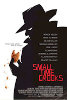
Here's an overview of nine other film posters that have borrowed from his style to various degrees.
 Clockers Clockers(1995) |  The Butcher Boy The Butcher Boy(1997) |  Lock, Stock and Two Smoking Barrels (1998) |
 Idle Hands Idle Hands(1999) |  Small Time Crooks Small Time Crooks(2000) |  Criminal Criminal(2004) |
 The Prisoner The Prisoner(2006) |  The Protagonist The Protagonist(2007) |  Flawless Flawless(2007) |
 UPDATE 11/20/08
While the initial poster artwork for the Coen Bros. comedy Burn After Reading (2008) certainly showed a Saul Bass influence (particularly in the typeface), this later design echoes his style even more.
For a thorough appreciation of Saul Bass's portfolio:
Saul Bass on the Web
Titles Designed by Saul Bass
Design Musem: Saul Bass


No comments:
Post a Comment