 Ten years ago, HBO was worrying about a new crime drama series they had in the works called The Sopranos. The cable channel was afraid the name would give potential viewers the wrong impression. People might expect a show about singers or musicians, rather than a New Jersey mob boss and his family. In the wake of media saturation by popular Classical music acts like the Three Tenors and their numerous knock-offs (the Irish Tenors, Three Mo' Tenors, the Three Sopranos, the Three Cantors, etc.), such trepidation from the network was certainly understandable.
Alternate titles that made implicit references to mafia culture—Made in New Jersey and Family Guy—were briefly considered, but an elegant touch in the show's logo design solved the problem completely. Graphic designer Corey Holms simply substituted a pistol for the letter 'R' and created what quickly became a cultural icon.
 The upturned gun is so equated with the show's brand identity, that HBO often didn't even include the name of the program in their media campaigns. A promotional poster for the sixth season depicted no one from the cast, but merely had an anonymous hand gripping a pistol. In a clever nod to the show's logo, the weapon is tinted red and doubles for the third letter in 'March.' This subtle reference, paired with the network's own logo, removes any doubt about which TV series is being advertised.
Unsuprisingly, Holms's typographic twist has since been mimicked several times. The 1998 hitman comedy Jerry and Tom references the HBO show with a pair of letterform guns in 'Jerry.' The DVD packaging even has a tagline that boasts "these guys make the Sopranos sing!" The pistol trick was borrowed again for the DVD of The Pleasure Drivers, except the designer opted for a realistically detailed firearm.
 Jerry and Tom (2000) |  The Pleasure Drivers (2007) |
 Mike Marino (2007) |  I'll Sleep When I'm Dead (2004) |
Garden state comic Mike Marino employed not one, but two famous mafia fonts on the cover for New Jersey's Bad Boy of Comedy, while the American DVD artwork for the British thriller I'll Sleep When I'm Dead flips the pistol around and puts it to work as a capital 'L'.
 Thieves and Liars (2008) |  Pistol Whipped (2008) |
The Puerto Rican drama Ladrones y Mentirosos (Thieves and Liars) uses both gun letterforms on its American home video release. Upping the ante, Steven Seagal's latest direct-to-video effort Pistol Whipped stuck a silencer on the barrel of the titular weapon and used it to represent the letter 'i' in both words.


 Although short and sweet, this one gets bonus points for working on more than one level. Not only do you have a fine "Whoops! I'm pregnant!" double feature, but the sign simultaneously describes the premise of the second movie.
 The beloved teen detective has grown up fast for this modern day film version. If only we had an idea of who was responsible for this predicament.
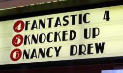 That's what you get for asking. It must've been one wild night. Either all four of them did the deed, or Johnny Storm is the culprit and the rest of the gang decided to share the blame as a show of team solidarity.
 Well, now it looks like the mysterious Mr. Brooks is also a candidate for fatherhood. The plot thickens.
 The boy wizard appears to be yet another suspect. This particular photo also gave birth to its own
  A second claim of Mr. Brooks as the daddy. He's a dirty old man! There's even
  That would have to have been an immaculate conception.
 What do you expect? They are pirates, after all.
 In case you were wondering where to start in getting someone knocked up.
 A ringing endorsement for necrophilia.
 Before
  Those Spy Kids have fallen on hard times.
 Wow. That's a mouthful (shameless pun intended).
 If they had put
  This was the first "naughty movie sign" I saw online, circa the year 2000. It's still one of the best.
 I may as well end on a dick joke.


 Posts
Posts

